Creating a calm and peaceful environment at home starts with the colors you choose for your walls, furniture, and décor. Calm colors can transform any room into a relaxing sanctuary, perfect for unwinding after a busy day or setting a tranquil mood for family gatherings. But with so many options available, selecting the right hues can feel overwhelming.
In this post, we’ll explore practical tips for choosing calm colors that suit your style and home, helping you create spaces where you can truly relax.
Why Choose Calm Colors?
Calm colors generally refer to soft, muted, or natural tones that promote tranquility and harmony in a room. These colors help reduce stress, make spaces feel more open, and encourage restful moods. Some common calm tones include soft blues, gentle greens, warm grays, and neutral earth shades.
Using these colors thoughtfully throughout your home can enhance focus, improve sleep quality, and even boost creativity. They also offer great versatility since calming colors often mesh well with various décor styles.
Tips for Selecting Calm Colors for Your Home
1. Consider the Room’s Purpose
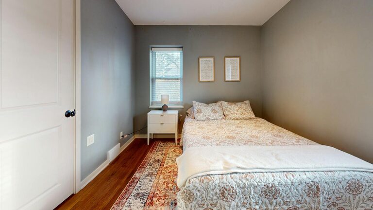
Different rooms benefit from different calming color palettes. For example, bedrooms often call for colors that encourage rest, like soft lavender or pale blue. Living rooms might use warm neutrals to feel cozy yet airy, while home offices benefit from gentle shades of green or blue to increase concentration.
Think about the main function of each room and choose colors that support those activities.
2. Start with Neutrals as Your Base
Neutral colors such as beige, taupe, soft gray, and creamy white are excellent starting points. They create a calm backdrop that allows other colors or décor elements to shine without overwhelming the senses.
Using neutrals as the foundation for your home’s color palette can also make it easy to switch accent colors over time if you want to refresh the space.
3. Opt for Soft, Muted Tones
Bright or saturated colors can sometimes feel stimulating or overwhelming. Instead, seek out muted and pastel versions of your favorite colors. For example, a dusty blue or sage green is often more calming than a bright cyan or vivid lime.
These gentle hues help create a soothing environment while still providing visual interest.
4. Draw Inspiration from Nature
Nature offers an abundance of calming colors—from ocean blues and forest greens to sandy beiges and stormy grays. Using these natural tones in your décor can create a sense of balance and tranquility.
You might even consider adding natural materials like wood, stone, or plants to complement the colors and enhance the calming vibe.
5. Test Colors in Different Lighting
Colors can look very different depending on the time of day and type of lighting in a room. Always test paint samples or swatches on your walls and observe them at various times before committing.
Natural sunlight tends to bring out true tones, while artificial lighting can shift colors toward warmer or cooler shades. Testing ensures you pick a color that remains calming in all lighting conditions.
6. Use Color Combinations Wisely
Combining calm colors with too many contrasting or bright shades can disrupt the peaceful feel. Instead, aim for harmonious color schemes using analogous colors (those next to each other on the color wheel) or monochromatic palettes (different shades of the same color).
For example:
– Soft blue with muted green and light gray
– Warm beige tones with cream and soft brown accents
7. Balance Color with Texture and Patterns
Calm colors don’t mean plain or boring. Adding texture and subtle patterns through rugs, cushions, curtains, and furniture helps maintain interest without overwhelming quiet tones.
Look for textiles with gentle patterns like stripes, small florals, or geometric shapes in soft colors to enhance your calm color scheme.
8. Don't Forget Personal Preferences
While it’s helpful to know which colors are generally calming, the best palette also reflects your own tastes. If you love a particular shade or want to include some personality, find a way to incorporate it thoughtfully.
Even a small splash of your favorite color in décor or accent pieces can brighten a room while keeping the overall tone calm.
Popular Calm Color Choices for Home Interiors
Here are some popular colors known for their calming effects:
– Soft Blue: Often associated with the sky and water, blue promotes serenity and can help lower heart rate.
– Sage Green: A muted green that brings a touch of nature inside and supports focus and relaxation.
– Warm Taupe: A neutral with warm undertones creating a cozy and inviting atmosphere.
– Pale Gray: A versatile modern neutral that adds sophistication without harshness.
– Lavender: A soft purple with a gentle, tranquil vibe ideal for bedrooms or bathrooms.
– Creamy White: Warmer than stark white, cream adds softness and warmth to any room.
Final Thoughts
Choosing calm colors takes some thought and experimentation, but the payoff is a more peaceful and welcoming home. Remember to consider how the colors make you feel, the purpose of each room, and how different tones interact with your furniture and lighting.
By embracing soothing, muted hues and natural inspirations, you’ll create spaces that invite relaxation and joy every day. Happy decorating!
If you have questions or want more tips on choosing colors for your home, feel free to leave a comment below!